Uber Kiosk
A long-shot concept pitch leads to an identified $500M opportunity for Uber.
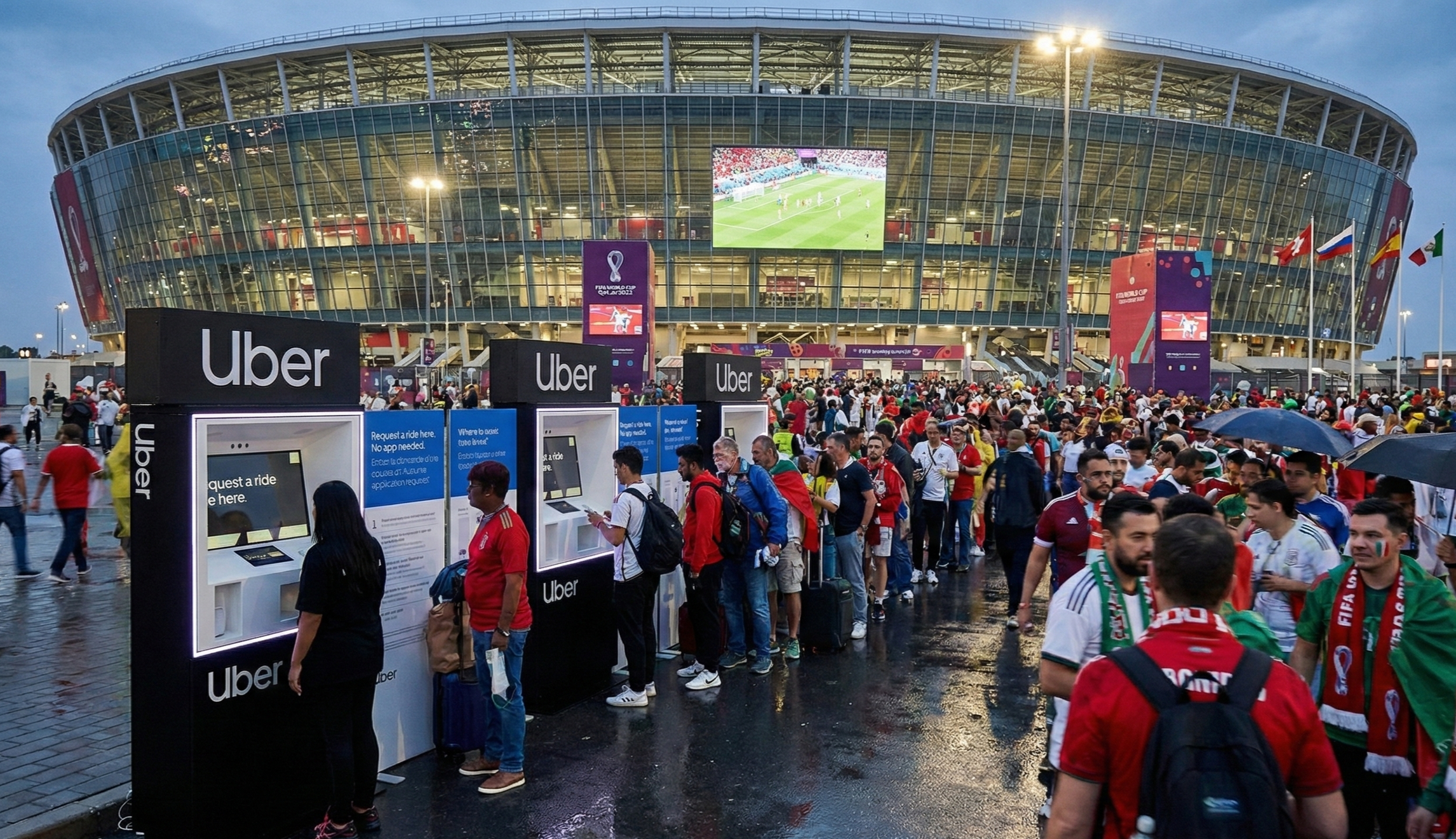
In 2019 Uber launched kiosks at Toronto’s Pearson Airport which was a strategic innovation partner that was open to next-gen ideas on how to move people better. Over a year earlier I had first pitched this concept as an answer to frustrations and problems riders and drivers were having at international airports like Pearson or large scale events and venues like Coachella. Fast forward eight months later and it became a big bold bet for the company with a market opportunity of over $500M.
Customers posing with an Uber Ambassador at Toronto’s Pearson Airport
Understanding the Problem
Early on after taking over leading design for Premium, Venues, Reservations and Travel teams I had the opportunity to visit Coachella in April of 2018. It was here that our team members from design, product, engineering and ops were able to come together each night and understand the many problems our riders and drivers were facing at large-scale venues like Coachella with Uber’s service at the time. Issues like lost phones and dead batteries, low or zero data connection, separated parties led me think of ways to get people moving to their destination without access to the Uber app.
According to the Pew Research Center, 23% of adults do not have smart phones. And when many people leave customs at a foreign airport, their phones are not able to jump on carrier networks abroad as easy as they could at their domestic airports. There had to be a better way.
Working interactive iPad prototype (left) and Airport curbside rendering (right)
Rapid Prototyping
Soon after arriving back from Coachella, I designed a simple interactive prototype using an iPad and my mobile device with a concept for a kiosk interface that could order rides for non-Uber users, or scan the accounts of existing riders using some sort of near-field ID.
About 8 months after I first pitched the idea, the product team circled back and declared that an Uber Kiosk was a new big bold bet for the company. Working with a couple of other designers for the UI, I designed a framework and proof-of-concept model for our future kiosk. It consisted of an attract-mode large screen up top, and a smaller screen for ordering rides and inputing payment info. I used foam core and hot glue (my two favorite tools!) and in a single day built a kiosk with room for a 12.9” iPad Pro that we were also building a short demo for. We then left it up in the office for a couple days to get feedback from peers.
Larger “attract-mode” screen sits above a smaller “booking surface” below
Final Design
Just like my initial prototype, the final design included a large attract-mode screen, and a smaller iPad-based screen for core customer interaction. A credit card terminal and keyboard were built in as well.
Customer ordering a ride with the help of an Uber Ambassador at Toronto’s Pearson Airport
Pilot Launches
Based on the learnings at Toronto Pearson International Uber will be looking at more ways to partner with other airports and venues in order to streamline and increase access to pickups at high-volume locations.
The very first Uber Kiosk customers at Toronto’s Pearson Airport
Customers & Press
Several news sites reported on the launch and most customers had high praise for this long over-due experience. The Points Guy even wrote about it!
From Prototype to Global Infrastructure
Uber Kiosks began as a speculative design exploration into what it would take to ensure ride access without dependency on personal devices, data connectivity, or app installation. The initial concept emerged from field research at large‑scale events and international airports where signal congestion, dead batteries, lost phones, and accessibility challenges routinely broke the core Uber experience.
After rapid prototyping and early‑stage validation, the concept was elevated internally as a “big bold bet” and identified as a potential ~$500M business opportunity. The first live deployment launched at Toronto Pearson International Airport in 2019.
In 2025, Uber announced the broad rollout of physical ride‑ordering kiosks across major global airports and venues — transitioning the concept from pilot to transportation infrastructure layer.
What began as a designer‑led invention to solve a hard edge case has now become a scalable access channel for millions of riders worldwide — expanding Uber’s addressable market to include:
Travelers without data plans
Riders with inaccessible or damaged devices
High‑density, high‑failure pickup zones
Accessibility‑constrained users
This trajectory — from pitch → prototype → pilot → infrastructure — reflects a core design leadership principle: innovation is not an artifact; it’s a compounding business system.


