Rider Preferences
An industry-wide feature request gives riders control and helps drivers always deliver a 5-star experience.
For years, riders around the world have asked for ways to let the driver know ahead of time that they have bags with them so the driver should pull over somewhere safe for loading. Or that while wearing a suit to a meeting on a hot day in NYC they would really prefer to arrive cool and refreshed. And maybe the rider has had a long day traveling and would love to take a quick nap on the long drive home from the airport at 2:00 AM. After hundreds of thousands of requests, we finally met their preference for this long awaited feature.
Rider UX
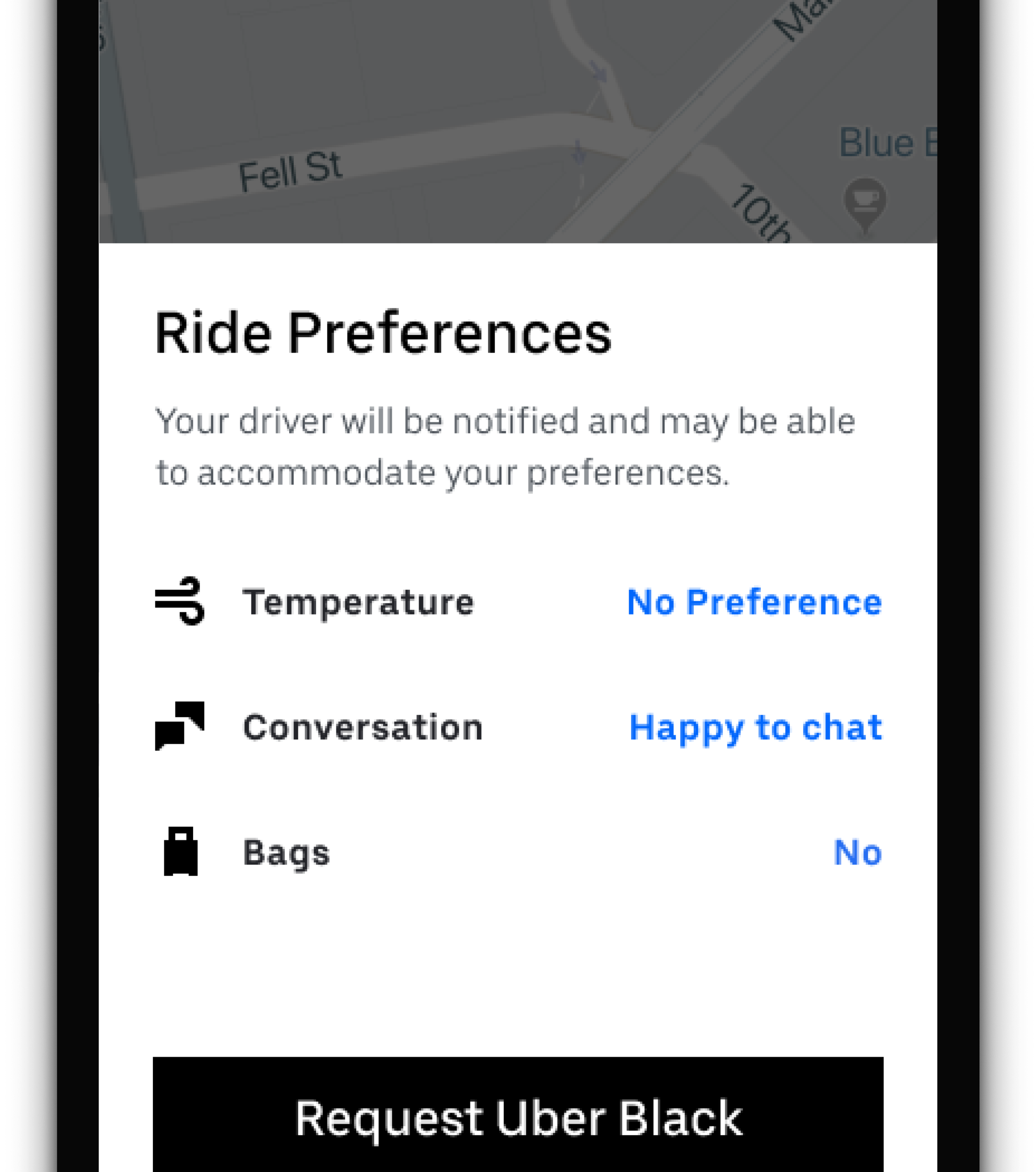
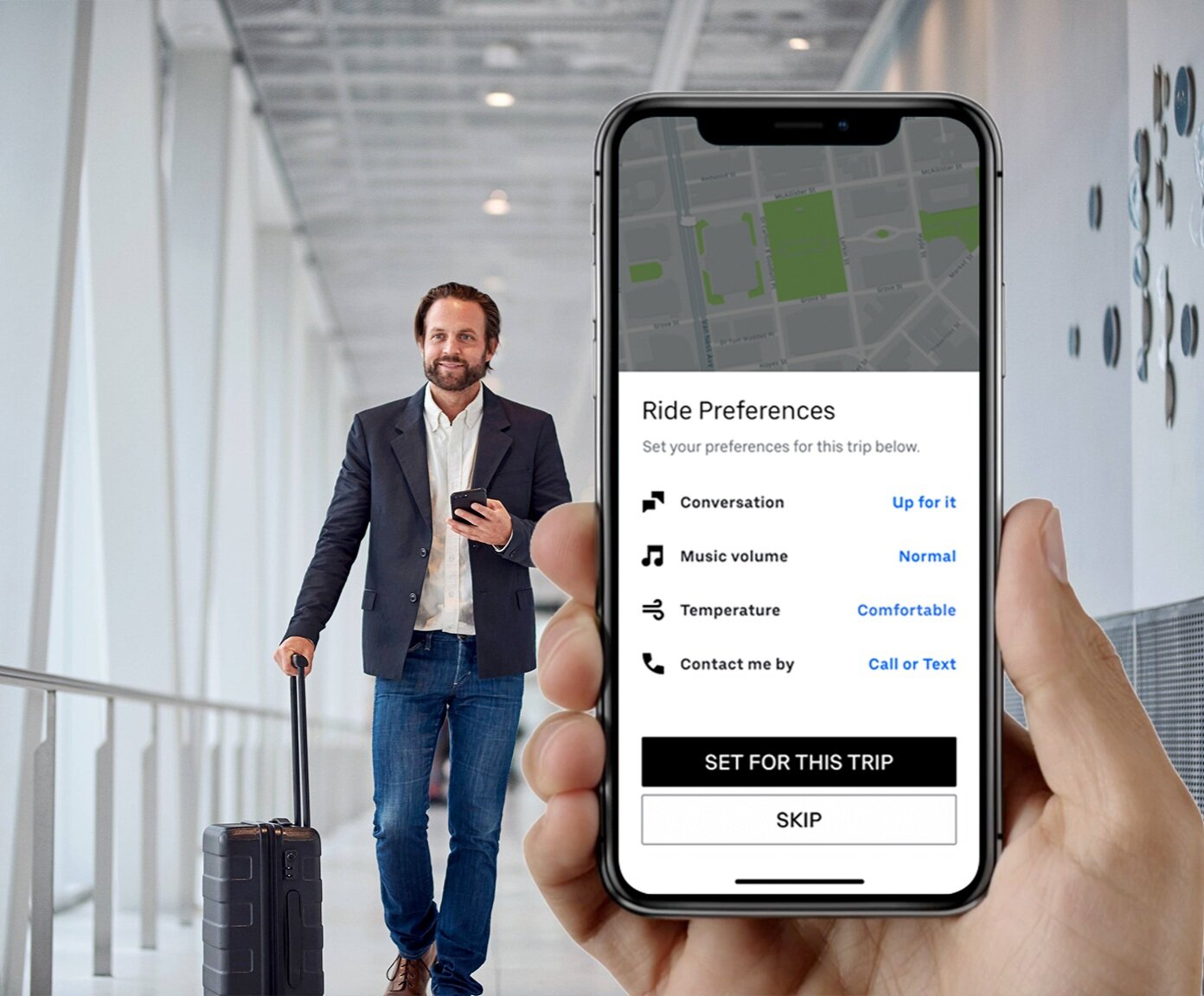
During the rider confirmation flow, we injected a screen that allowed riders to select their preference through multiple taps. The interaction proved to be discoverable and very simple to both use, and to build. This was only offered for premium rides like Uber Black and the soon to launch Uber Comfort.
Driver UX
It was very important that we designed the Driver experience in a way where it did not impede the driver’s ability to get their job done quickly and safely, but that they also saw the requested preferences. This proved to be a very tough challenge and I had to go back to the drawing board several times after some early testing. For the MVP, and due to some engineering constraints, this design ended up being the best path forward to build-ability and driver success.
One of the images used in a rider survey
Why offer this to riders?
Across twitter, facebook and in the news, Riders had been begging for this feature for a long time. As design lead for the Premium team, I had to make sure at launch we got this right.
Some product managers were pushing for music volume as being the top preference we should prioritize. I had a hunch we should learn more from our users and I turned out to be right. I built several designs along with a survey and we polled about 1000 riders from all over the world. Temperature was actually the top most requested, followed by overall conversation and noise level—not just music. Luggage was another one because of the safety and time factor, so we also prioritized this as the third option while scrapping the contact preference as a 4th to declutter the choice experience.
Next-gen designs
Future versions
For the initial version of Uber’s Rider Preferences, I had to design using the constraints of where are new design system was at the time—it hadn’t launched yet. While designing the MVP version, I also drew up a fast follow and future version which too into account our new iconography, typeface and overall look and feel of Uber’s new Rider UI (code-named “Halo”).
I had always intended to design the temperature controls with color in mind, as well as easier softer touch targets. The old system only allowed for borderless links instead of buttons.
Lyft’s Rider Preferences product borrows my design
The sincerest form of flattery
In October of 2020, Lyft’s premium offering called Lux unveiled their version of Rider preferences. With a design that mirrors the same one I designed for Uber, I chalk it up to a winning design and am very flattered.


