Pin Dispatch 2.0
Building a better and safer waiting experience for riders.
Uber was encountering many problems at events and venues (like concerts, stadiums, and airports). I was tasked with discovering the user goals, needs, and problems of riders and drivers at large-scale events like Coachella or the Super Bowl. Using design thinking methodologies like user research, field observations, design sprints, and rapid prototyping, I was able to design a solution roadmap for the short-term and long-term Pin Dispatch product.


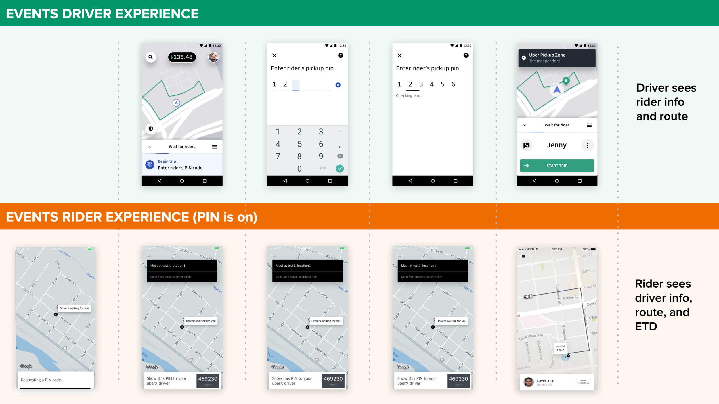
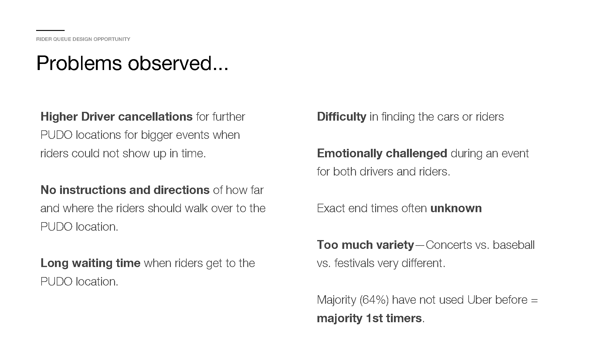
Discovery & Insights
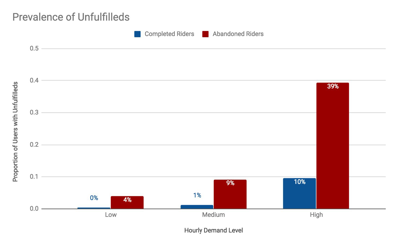
Observing and interviewing Riders and Drivers, it was obvious some things were broken about the first generation version of Uber’s PIN system.
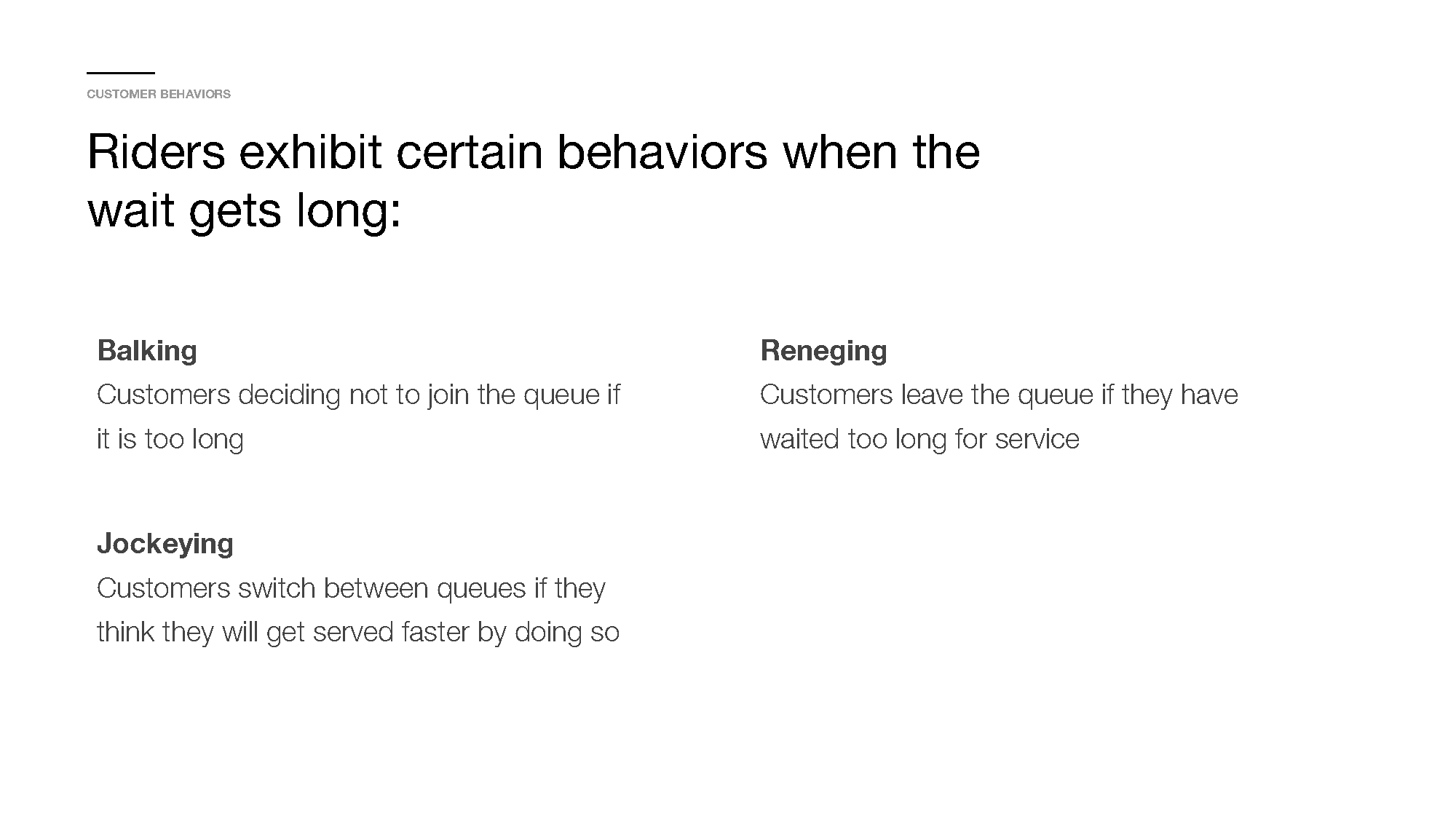
Drivers complained it took too long for riders to find their PIN and manually enter it in. Many Riders thought the PIN number listed was actually the license plate number, so they would often wander out into the PUDO (pick up drop off) lot which was very dangerous. This led to them never finding the right driver, when in fact they could just get into any driver’s car at the front of the line.
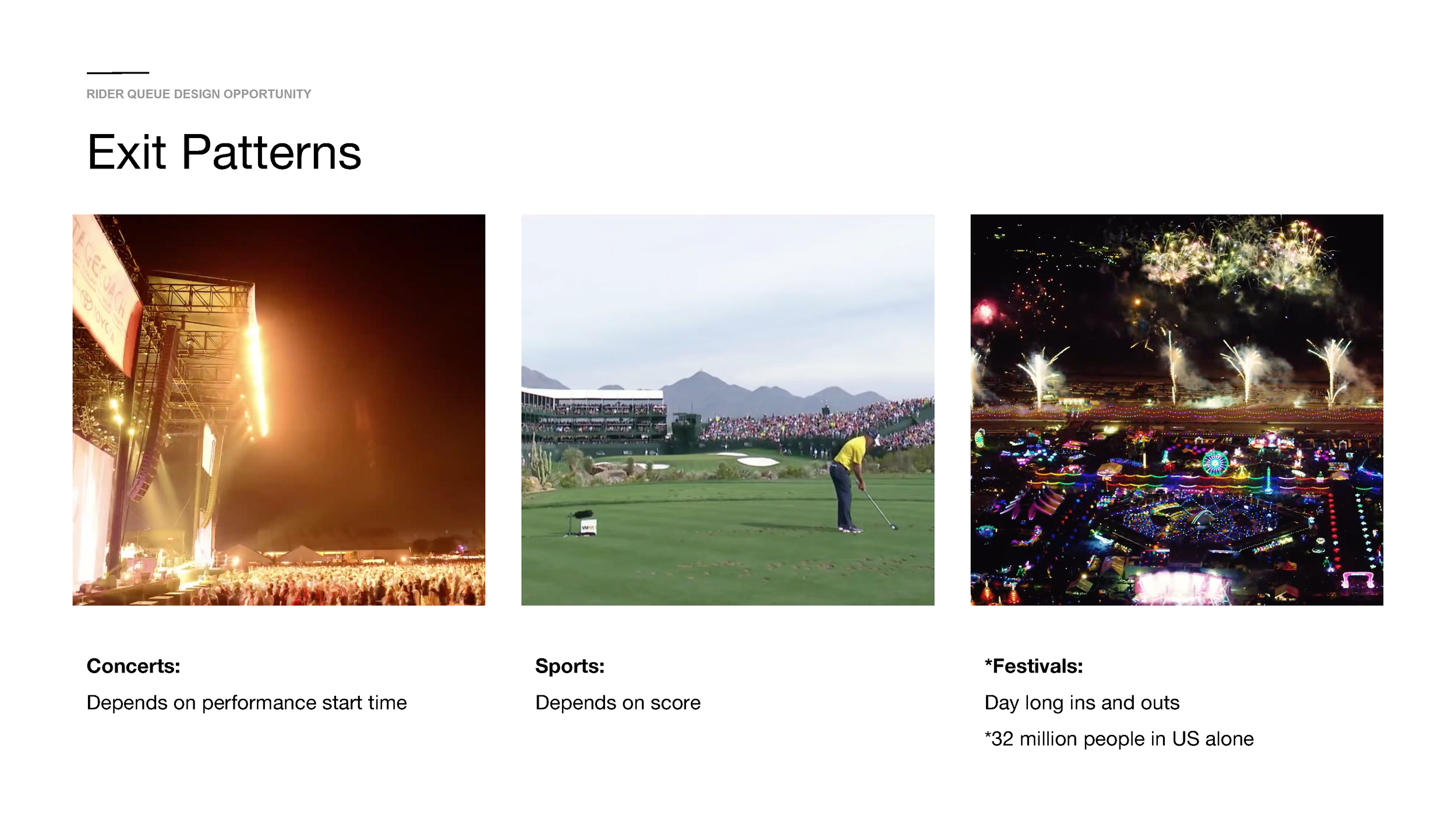
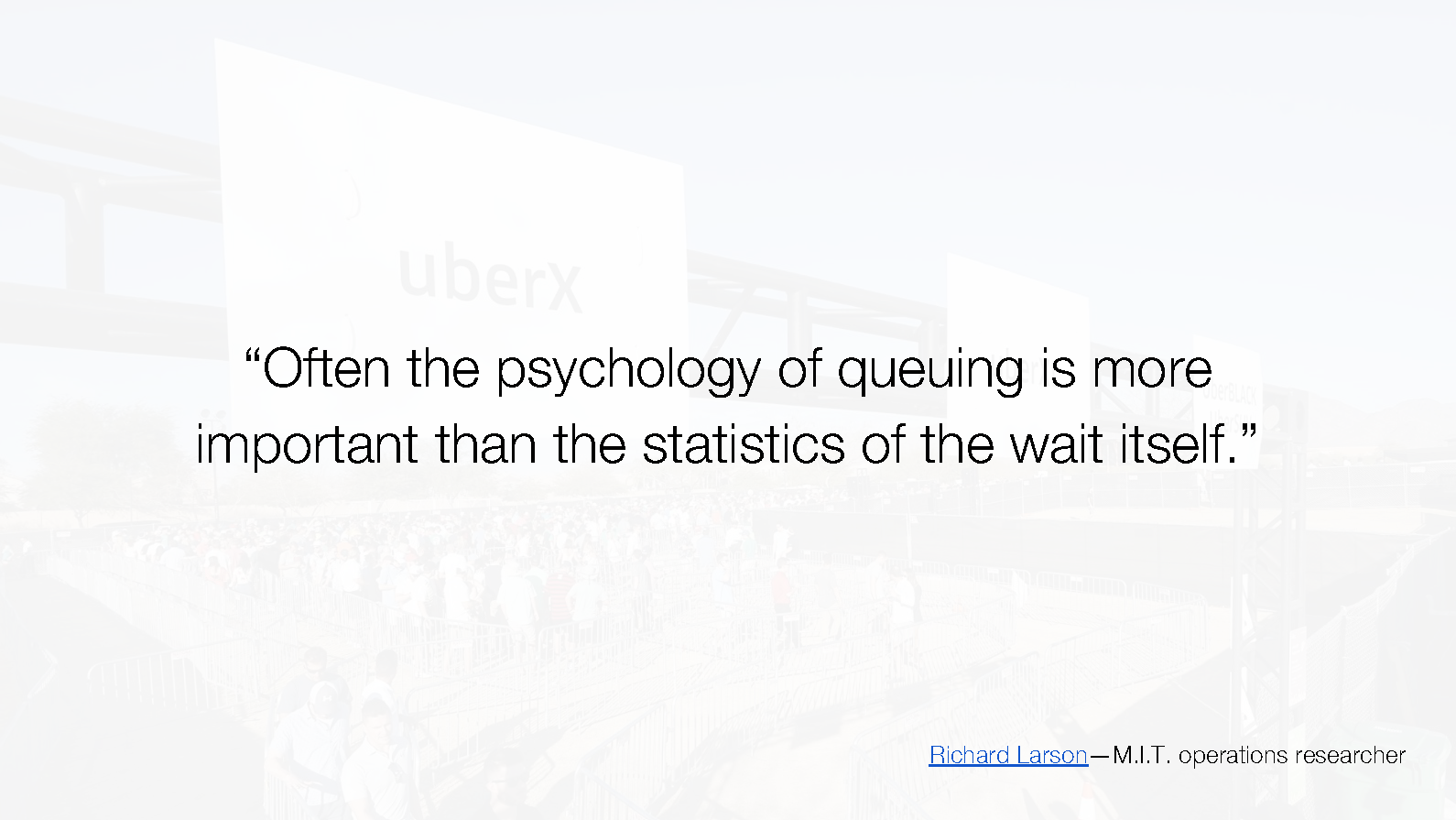
The psychology of queueing up at ingress and egress for events also played a major role in developing our future roadmap.
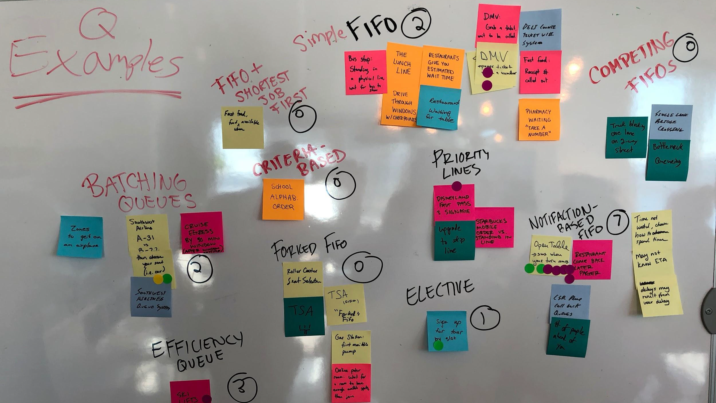
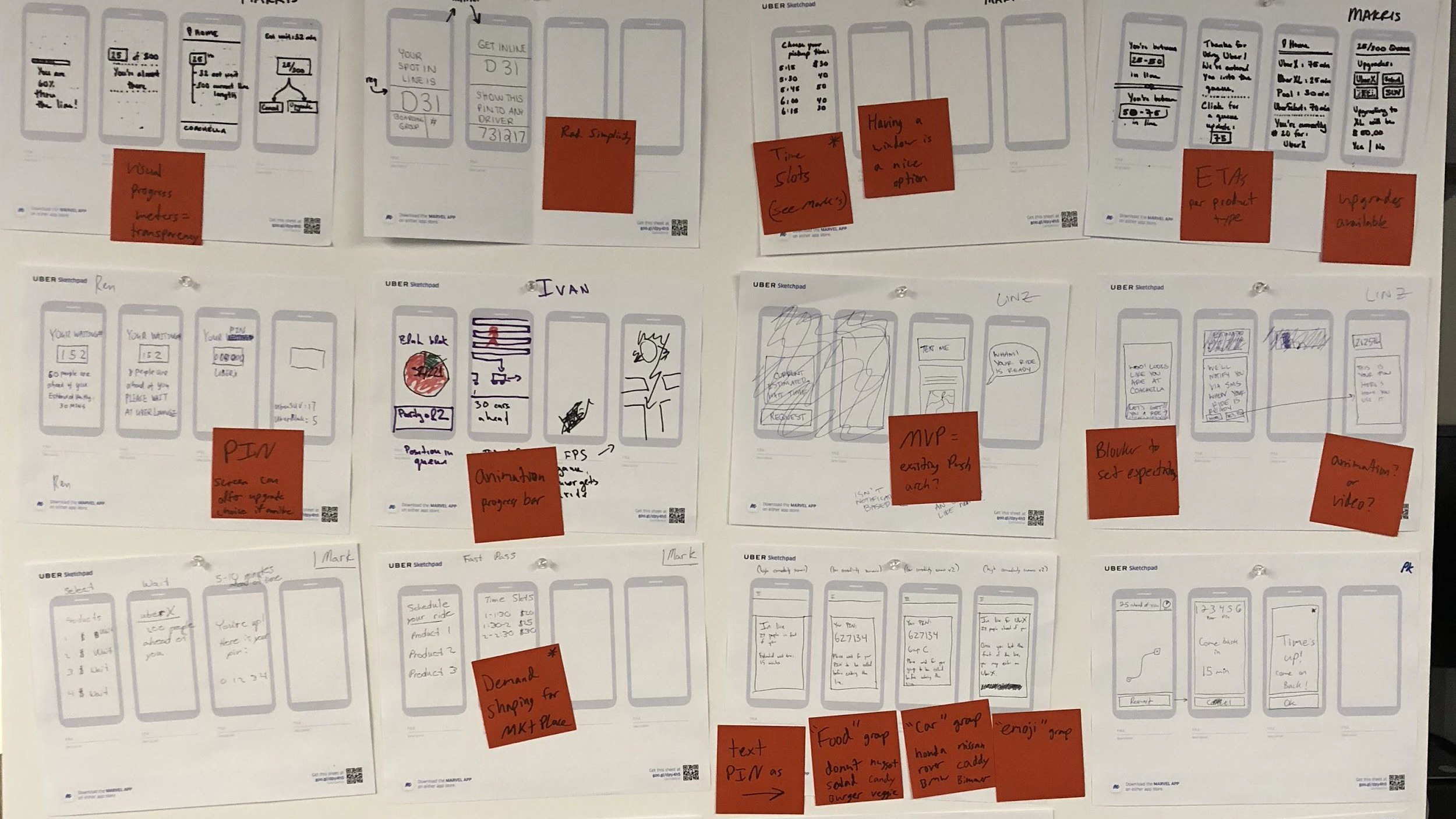
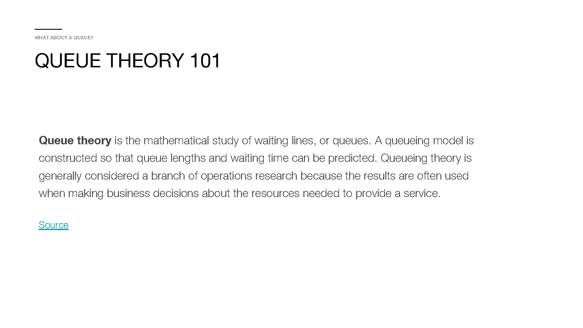
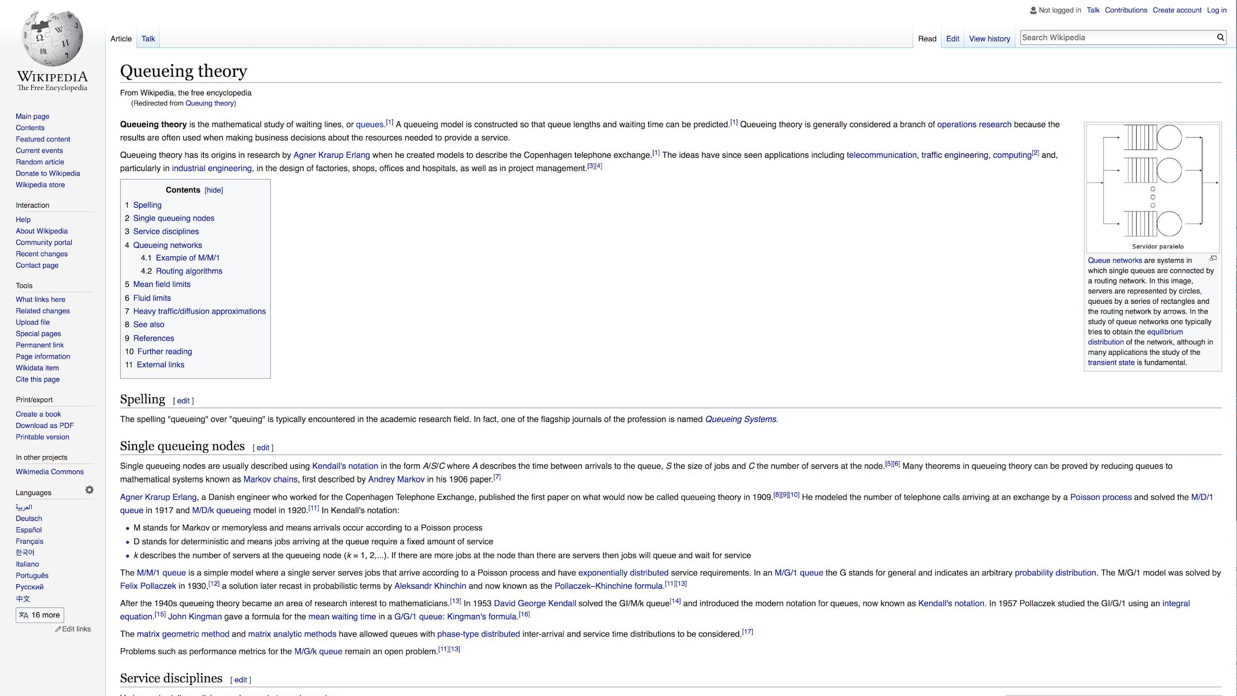
Design Thinking & Q-Pin Concepts
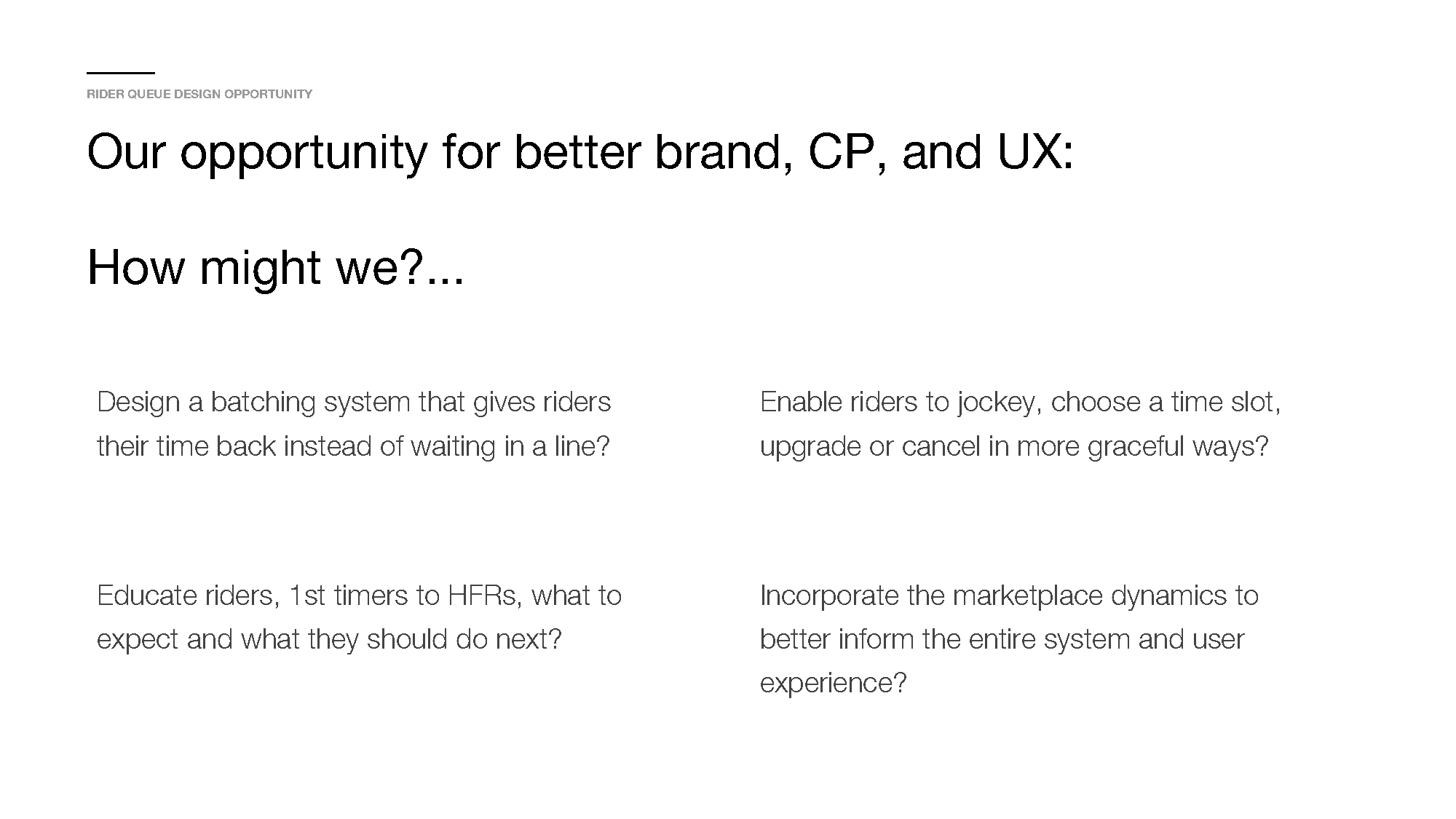
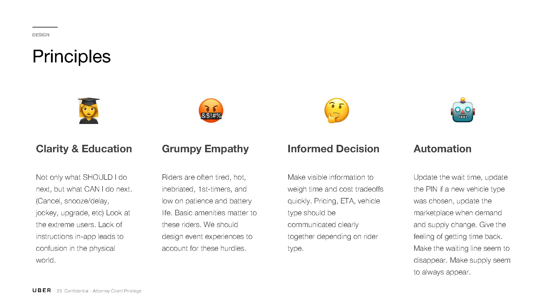
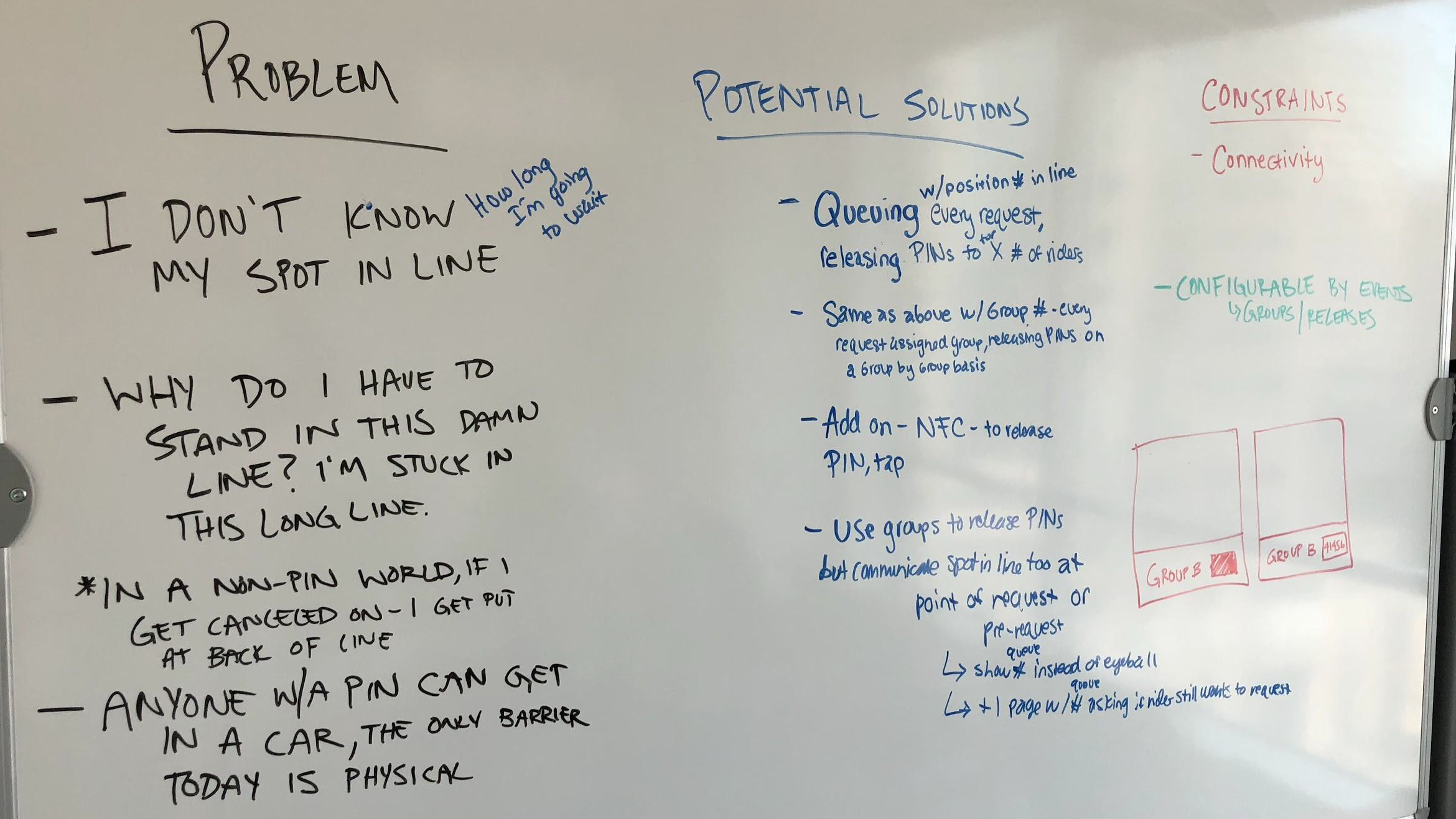
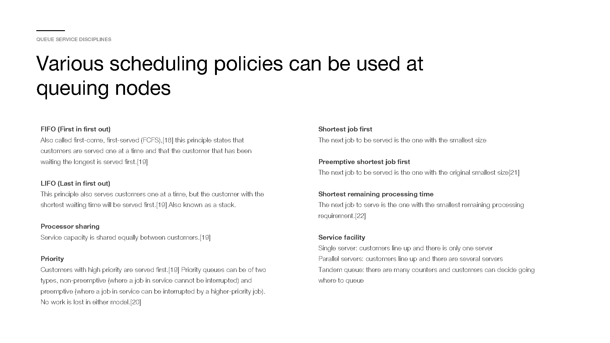
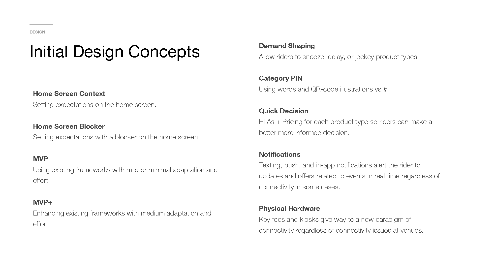
Knowing the pain points and problems with the current system and design, I organized and facilitated a design sprint—the first this product pillar had ever done! I then designed and pitched multiple mild to wild concepts based on current and future technical capabilities, while our MVP version would improve the KPIs, legibility, and comprehension speed for both user profiles. We called our future queueing model “Q-PIN”.
By taking advantage of more modern technologies that would allow for simpler and more efficient UX, we could eliminate many of the headaches for riders and drivers. Things like hypersonic audio tones or QR codes for faster authentication “handshakes”. Instead of forcing drivers to type in a code, and riders read one-off, what about scanning a QR code, near-field communication, or even simpler more fun codes?
Updated (MVP) version of the Rider PIN card
Final Designs
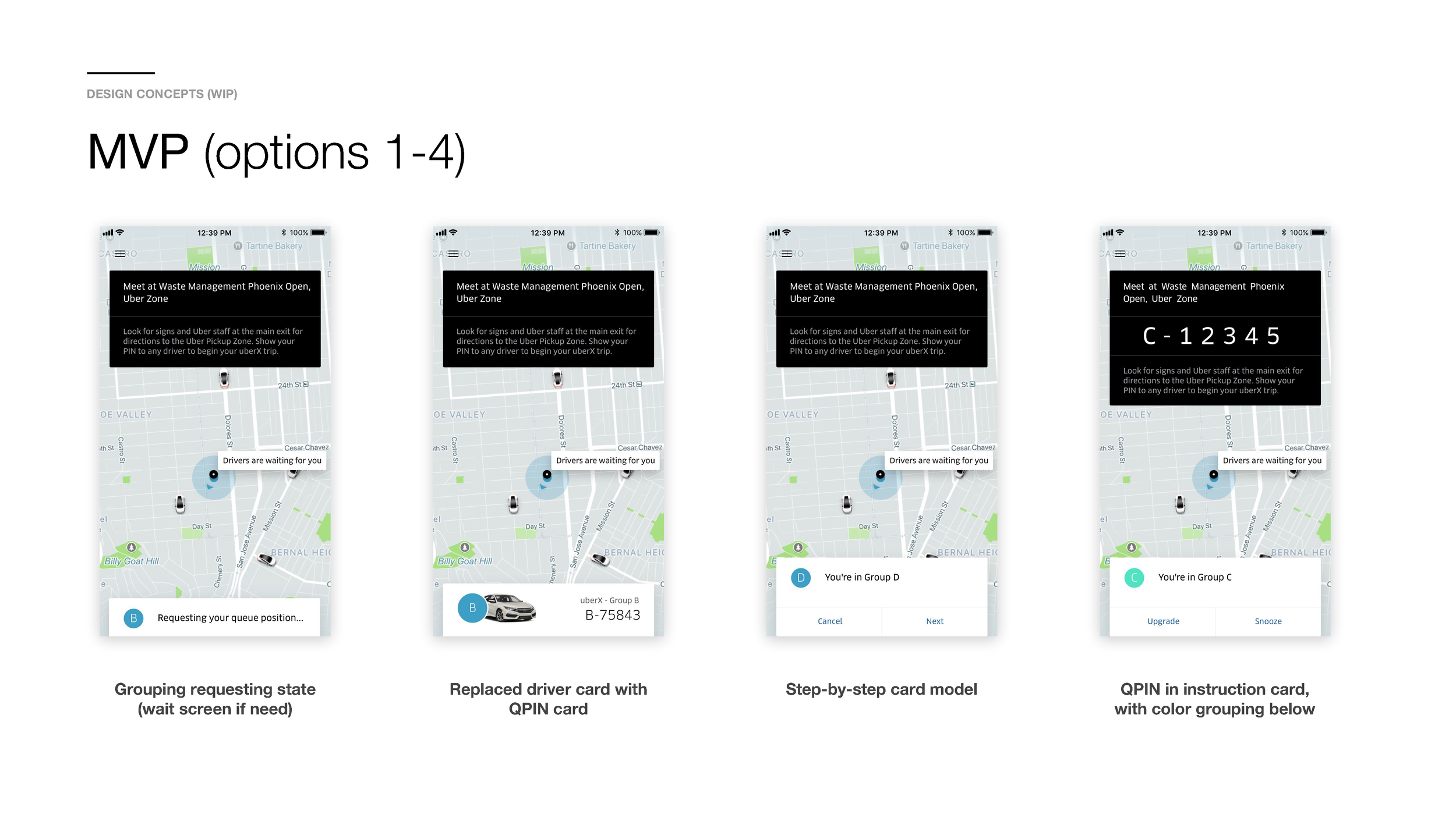
For the MVP, I designed a better PIN card that looked less like a license plate, was larger, clearer, matched other passcode formats from our Bike product, and tested really well with users.
For the driver app, we matched the new rider PIN style with the driver app input fields.
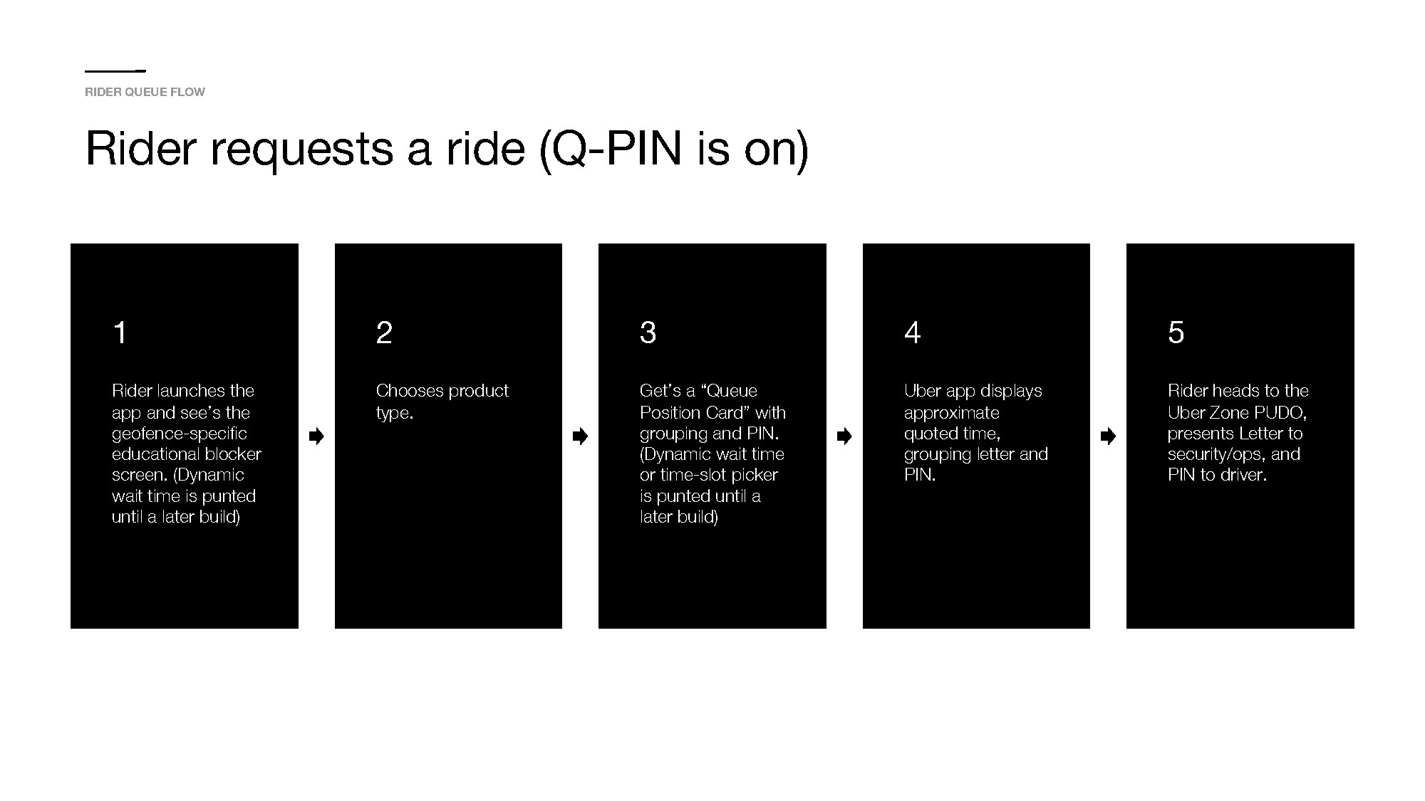

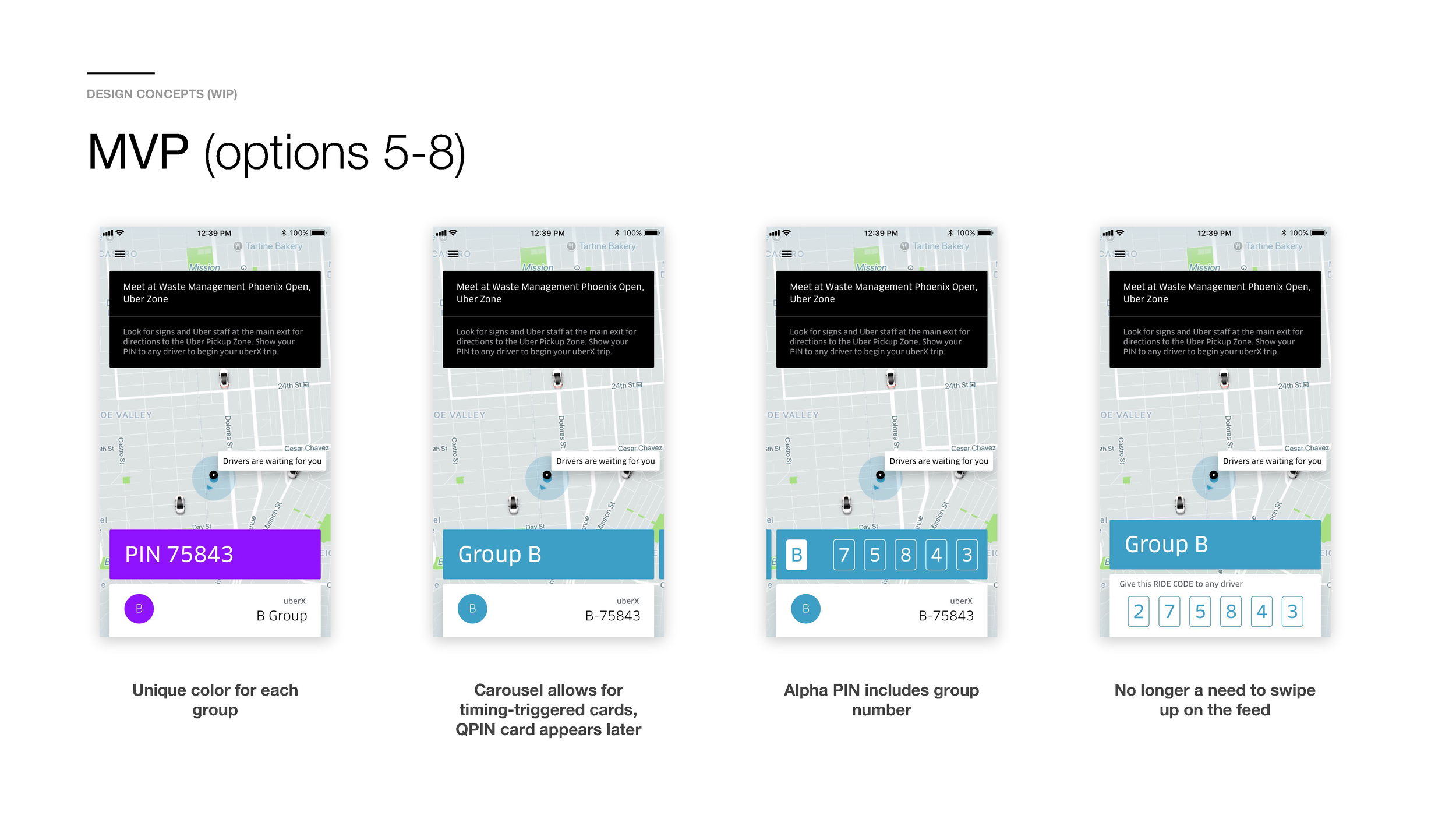
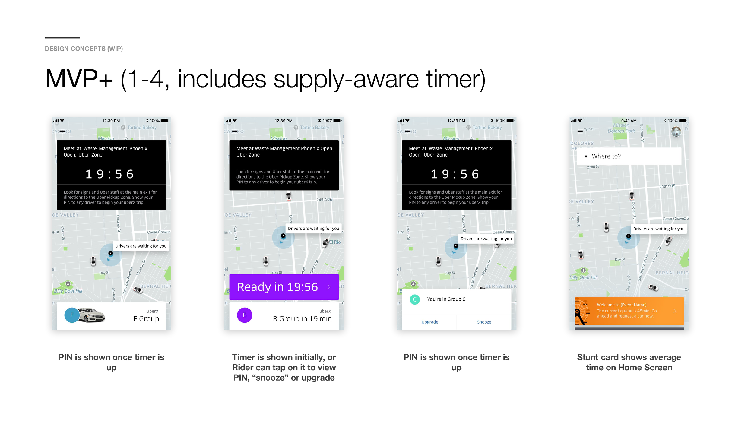
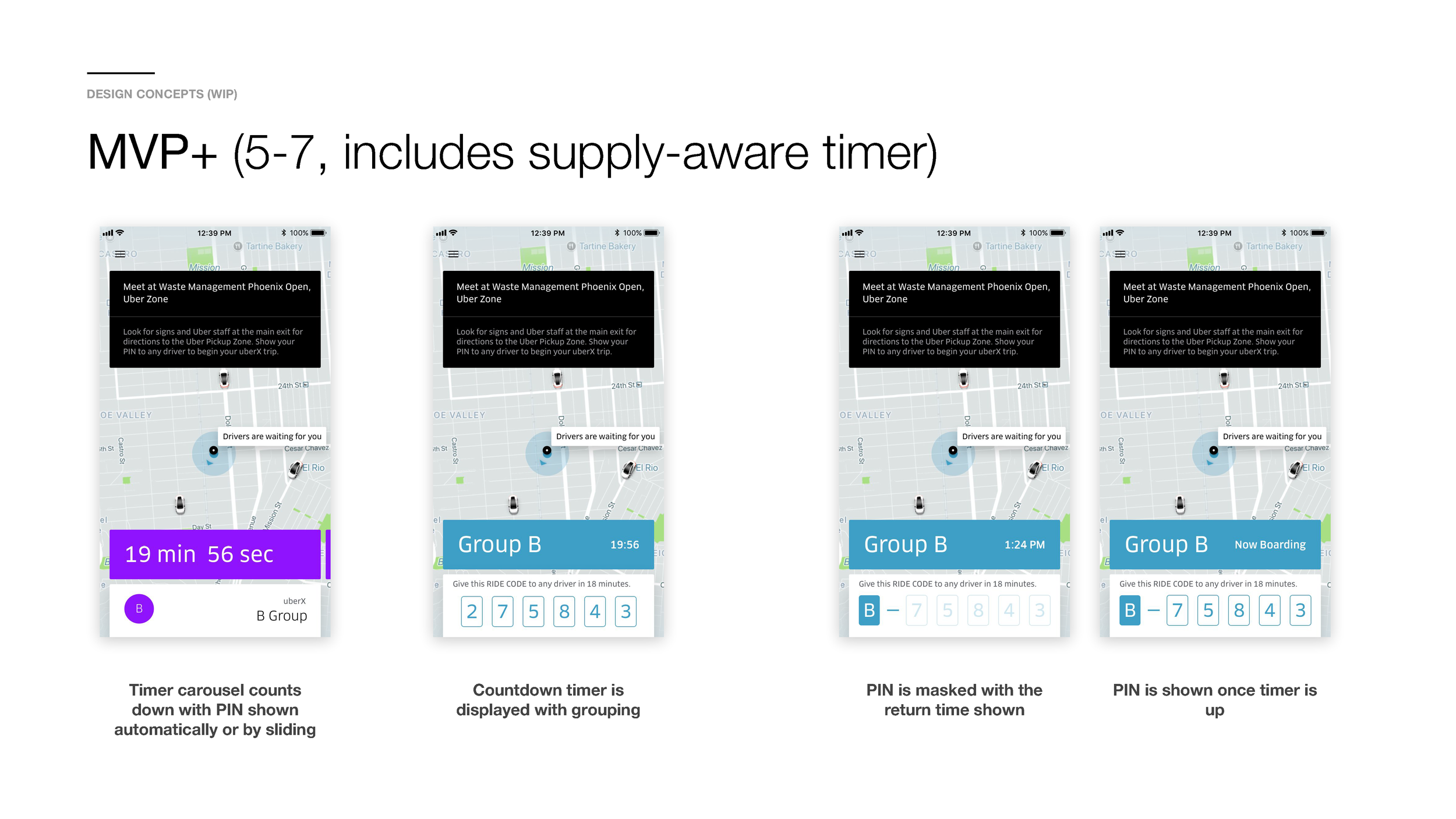
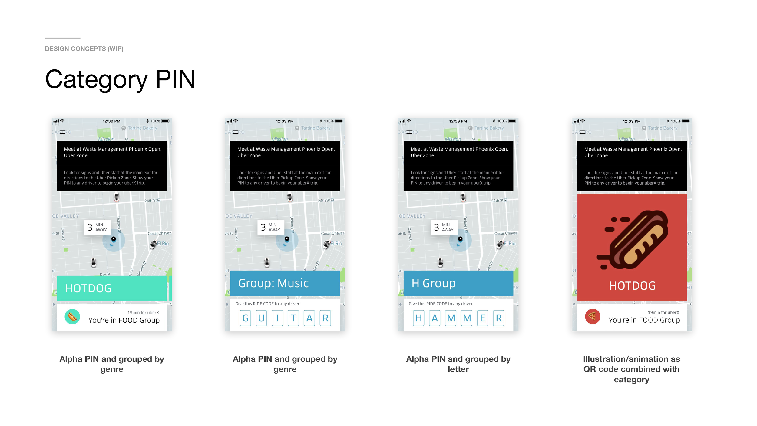
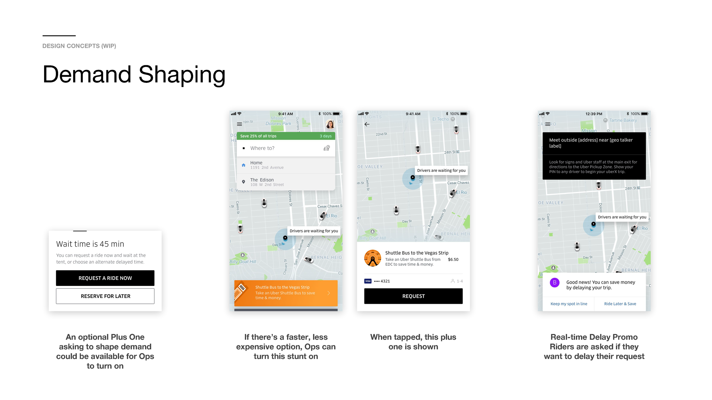
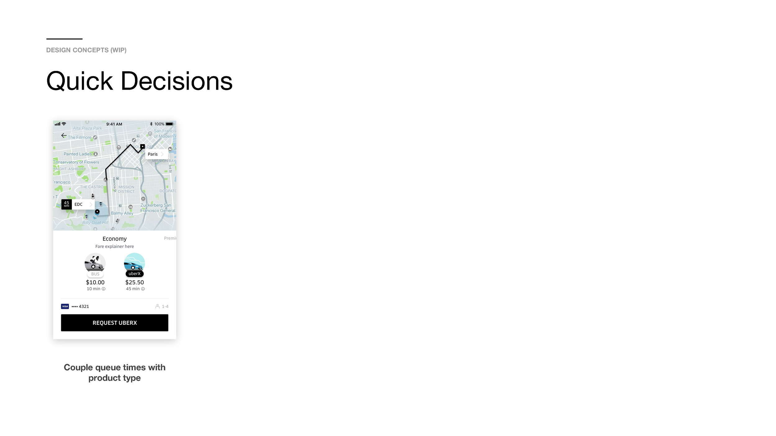
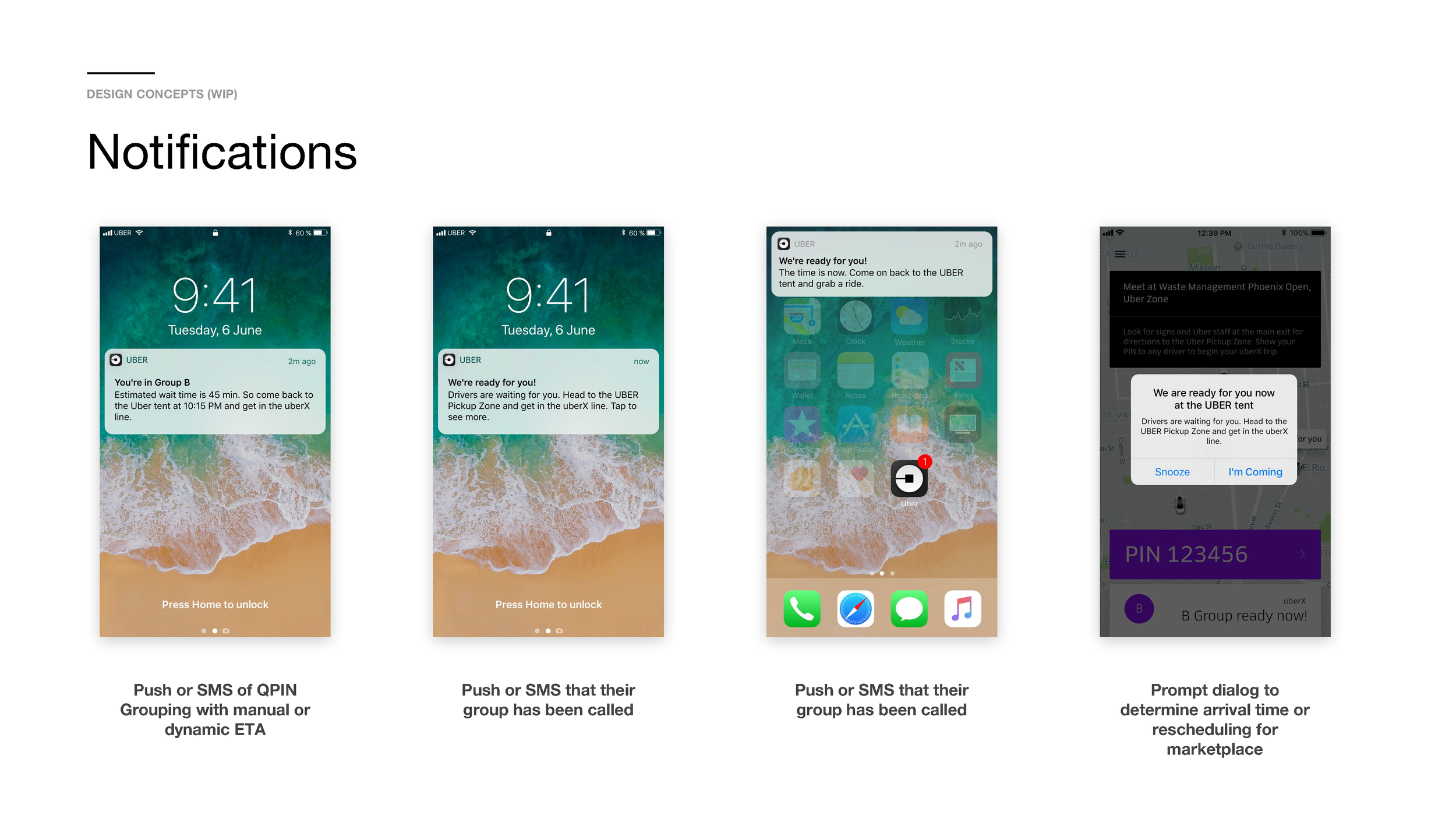
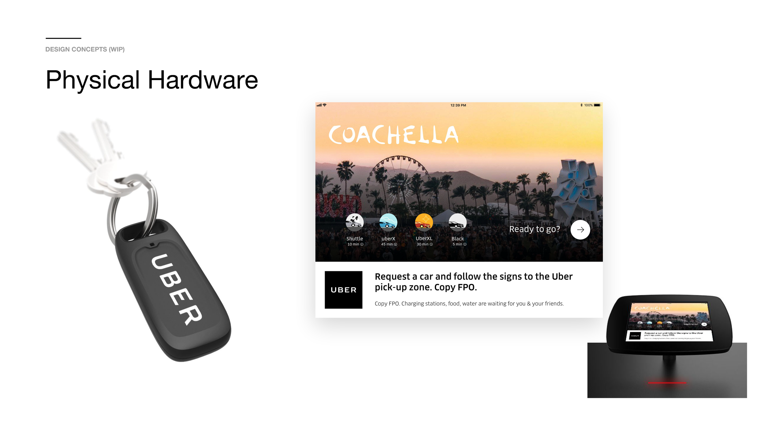
Q-PIN Northstar Vision
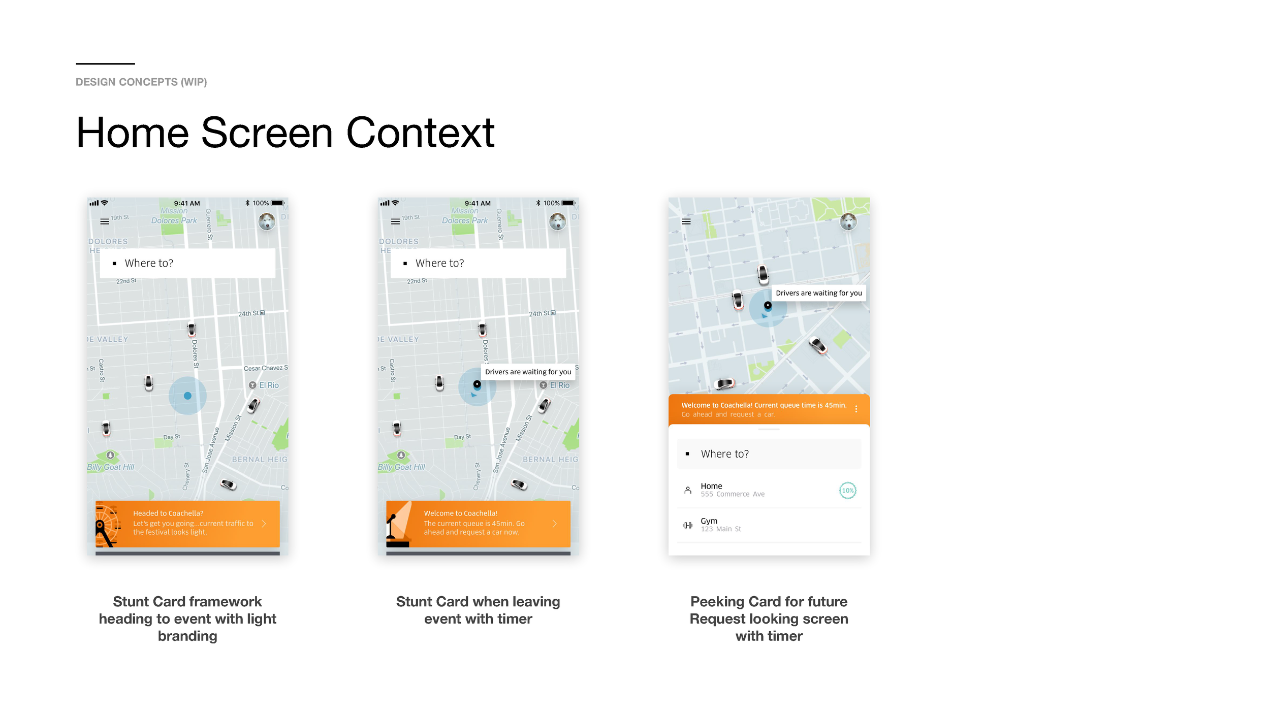
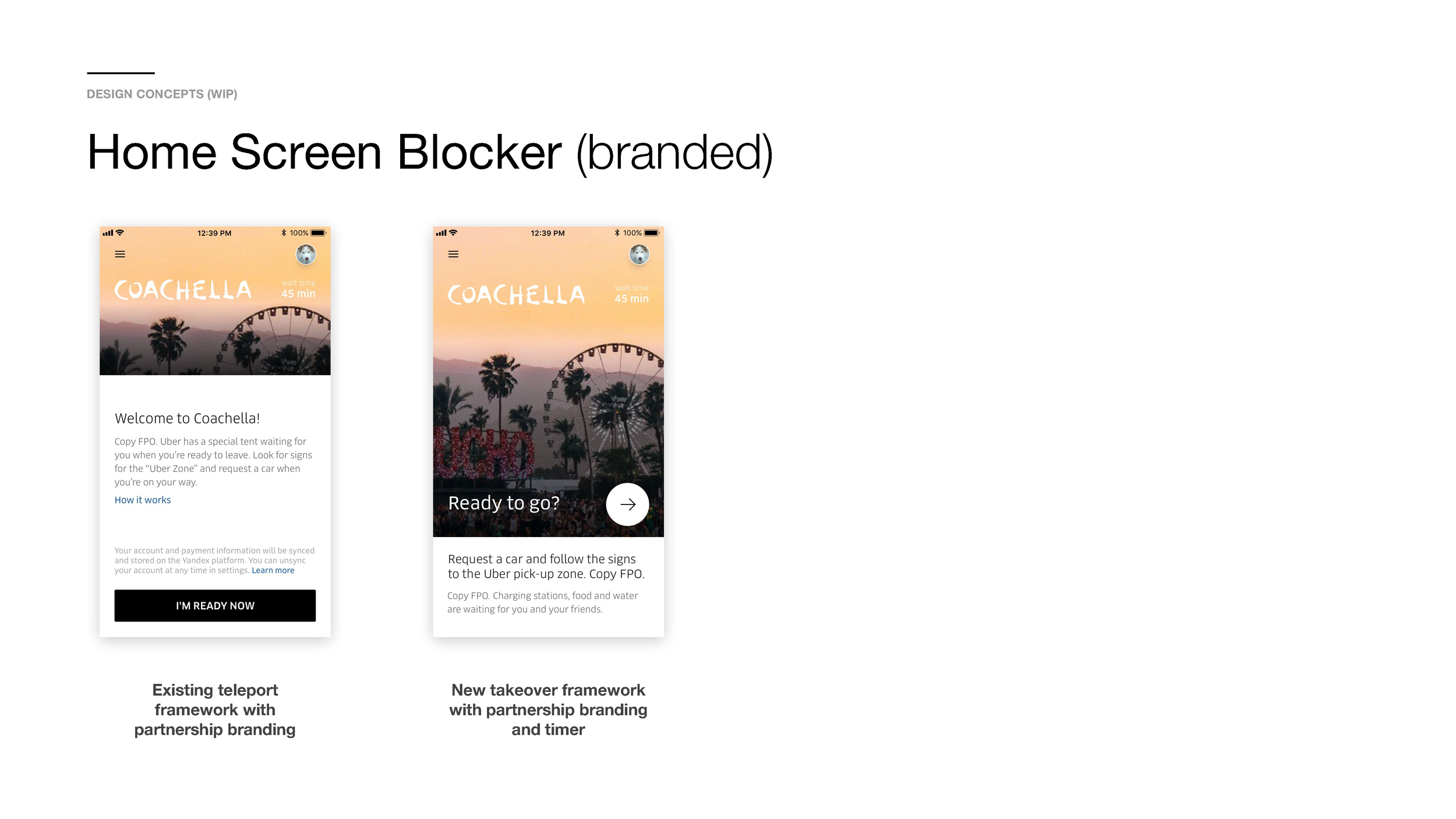
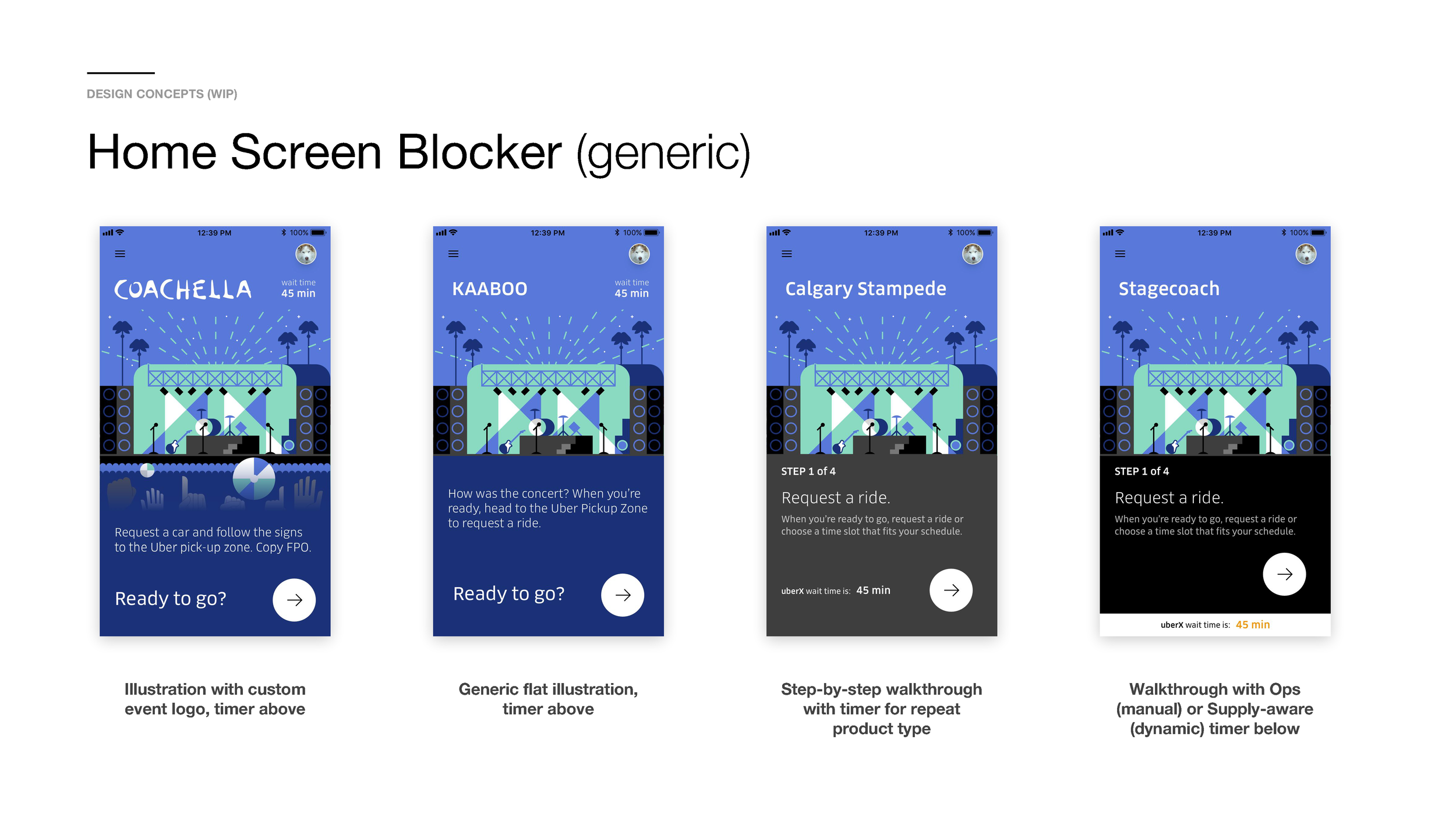
For post MVP, I designed several concepts which also tested well with users and provided a roadmap for the product team once the backend and other feasibility concerns were addressed.
The Kiosk concept was eventually productized in 2019 and launched at Toronto’s new airport.
First Airport Trials
In May of 2019, Uber debuted this new version of Pin Dispatch for Airports at PDX (Portland International). Read more about this on Techcrunch and Mashable.


