Venmo Card
Before the launch of their first card, Venmo needed a vision.
Venmo was about to launch a physical debit card to accompany their users’ digital experiences and allow for making purchases at physical POS machines worldwide. The product team asked me to help out by coming up with a few concepts on graphic design for the card in addition to anything else that would make a splash in the industry.
This was Venmo, a beloved financial tool of millennials, made famous with emoji’s becoming part of the core UX. I came up with a range of concepts for card integration, some new social experiences, as well as taking advantage of new features in iOS.
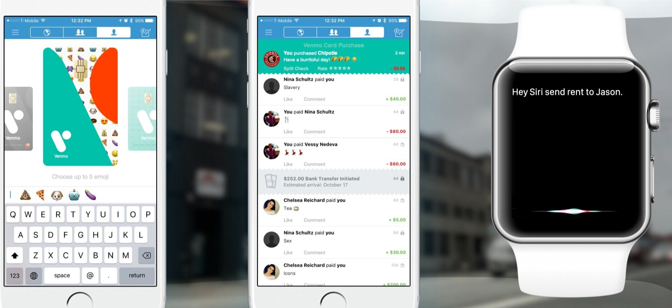
In-app design wizard to customize your card with your top-used emoji
Bespoke debit cards
This was going to be Venmo’s first foray into debit cards to unlock new experiences for their digital-first millennial users. As I started to explore ideas it hit me that so much of Venmo’s brand equity has been built up by the delightful and playful ways users add emoji to their transactions. Why not play this idea way up?
This concept allowed the customer to choose a bespoke Venmo card based on their top five most-used emoji, or choose 5 other ones. This also brought the upcoming brand revision work into the design as well.
Split check push notification
“Split the check”
This ended up being a core concept to the new physical card — How might we bridge the digital experience of splitting bills with friends with the contextual awareness of a physical swipe in a real location?
After a venmo user swiped their card, they would get a push notification in the app asking if they wanted to split the charge with a friend. Based on machine learning and location-based or proximity awareness, we could even suggest their actual friends who were around them in that moment.
Ahead of it’s time
Today, this feature is built into iOS and Siri will ask which app you want to use. I first pitched this concept in 2016.


