Card Reader 2.0
Challenging the status quo through hardware and software UX innovation.
The idea was simple really. In order to add a better UX for point-of-sale users (both customers and merchants), we would need to add a larger screen. This presented a potential increase in BOM costs.
My concept centered around the notion that all merchants and their employees already possessed a high resolution display, battery and data connection. They simply needed to dock their mobile device inside of a new PayPal device with a translucent cover so that they could interact with the smart phone screen and corresponding PayPal merchant app.
Status Quo
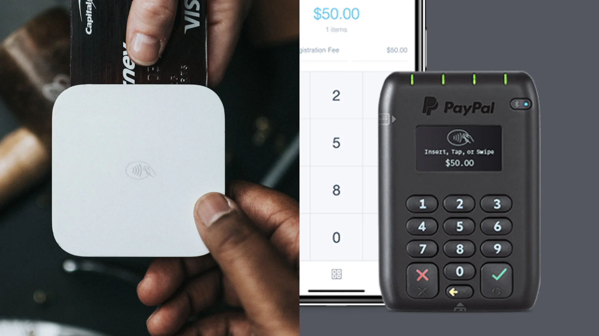
Card readers were quickly coming to market. Square had just launched this $50 version. Paypal’s own dated version still cost $150 at the time and had a very tiny calculator-like screen. This was not acceptable in the market as a leader.
Rapid Prototyping
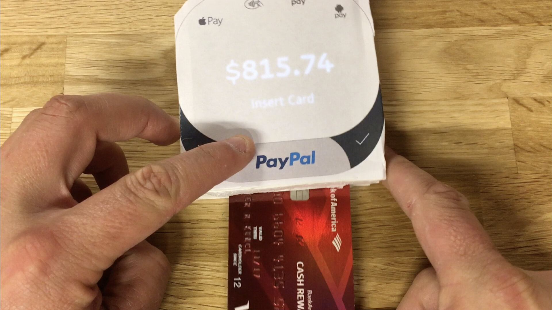
Once again, I reached for my favorite design tools: foam core and a hot glue gun. In one hour I was able to draw some industrial design CMF touches in Adobe Illustrator, printed that out and created a small foam core model with a slot for a phone and a slit for a credit card. Using wizard-of-oz techniques and choreography I teach in my prototyping workshops, I was able to demonstrate my concept the very same day to leadership and later to IP counsel.


